Amanda & Eric 03/03/10- WP/WHP/Sago Cay Centerpiece Ideas!

I admit to being a long time lurker. One of our big anniversaries is coming up in about a year and a half and we are doing it big.

I was reading about the "matchy" or lack there of in the recent fads and i wondered if there was a good compromise for the shoes for the MOH?

I was just in a wedding last year and none of our shoes matched our outfits except that we all had metalics on. Some had splashes of color (mine were silver and black) and others were flat metalics.

I wondered if something like this would work? You could get splashes of pink in with more 'neutral' bases. So it would 'match' yet 'not match'? Not all of these are exact or good matches for the tones, but I am going for an idea.

The rest of it I am very much liking and enjoy getting ideas from all the planning journals. We are waiting to see if we can afford disney for a VR or not. If not we'll do our own little thing in private and just "live big" the rest of our trip :)

http://www.zappos.com/product/7492195/color/197810
http://www.zappos.com/product/7514720/color/559
http://www.zappos.com/product/7516855/color/188844
http://www.zappos.com/product/7565988/color/1728

Just some thoughts before I go back into lurkdom :)
 
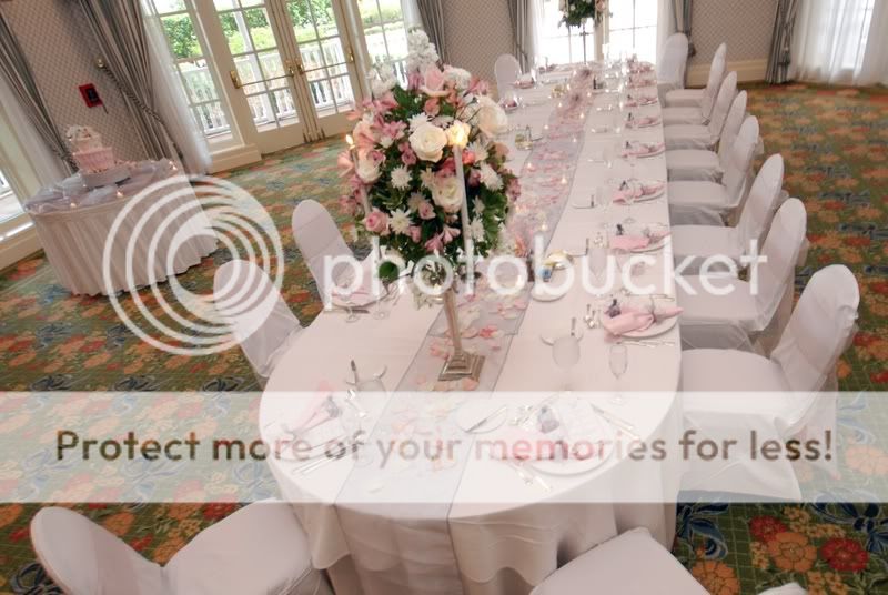
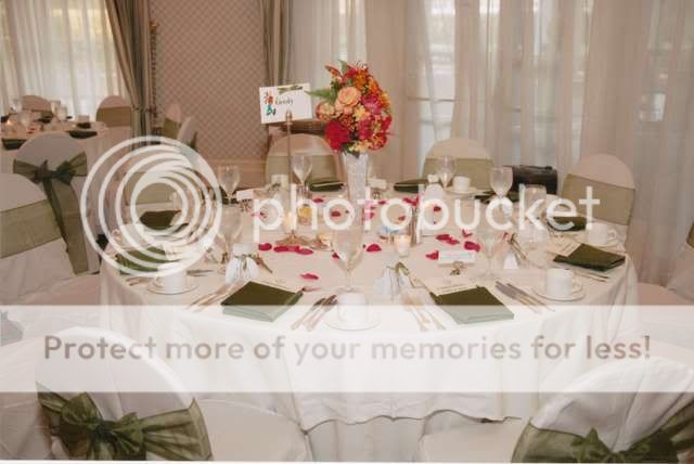
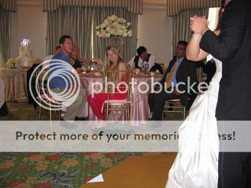
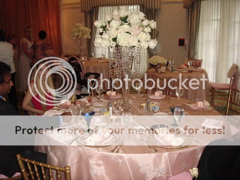
Here are some pictures I found...
62008.jpg


reception-tablesetting.jpg


IMG_3006.jpg


DSC05404.jpg
 
The bluebird pin is very pretty and a nice idea and that's exactly how I would incorporate the blue - small touches, but not as a main color.

The centerpieces with blue light are pretty, as are the blue crystals.

Again, if it were me, I would do the two main colors as green and pink. Wear blue shoes, have the bouquet you love. I would even add small blue crystals to Jazzy's bouquet. At the reception, keep the blue as an accent. Do the blue as a light (in the example posted) and perhaps to the hanging crystals.

I would really reconsider the tone of pink. While I love the hot pink, it doesn't look the greatest with the green you have (they are in different color families). Since the dress was already purchased, you can't change the shade of green, so changing the pink is the best idea. Then, have Eric wear a pink tie, the groomsman wear green.

I have to say, I'm not a fan of the chair covers. I would keep the table settings understated; I think the "less is more" idea is just more elegant and timeless.

I like Jean's idea of Jazzy's shoes! I think if you do a metallic with a touch of pink, it would look nice and people wouldn't be distracted by the shoes standing out (since YOU should be the center of attention :)).


Again, I hope I didn't upset you with my opinions, as they are just my thoughts, but sometimes an outsider can help.
 
Another vote for less is more. Love the idea of blue lights with pink and green flowers.
 

I know I couldn't make up my mind about a lot of linens, etc. but Disney Floral really helped me narrow down our options. You could even alternate tables between the different colors too :goodvibes

I didn't think of alternating tables! Thanks!

I was playing online, instead of working and suing people LOL.

Here is something dramatic. What if you went with some pink and green flowers with a blue light in the vase or green and blue flowers with a pink light in the vase.

7934_1_waterlight.jpg


These have your colors with blue, pink and green hydrangea.
tall+centerpiece+WASHINGTON+DC.jpg


Just some thoughts. I love the crystals on that one centerpiece by the way.
OK I LOVE the first one!! Thanks Toni!!!

I loove the lights in the centerpieces, (I'm doing them for mine), although I'm not having flowers. Three cylinder vases on a mirror with the blue light and white floating candles. I haven't decided if I will do pink petals, or pink napkins, but I can post pictures tonight. I have a couple pics in my PJ, but just of the vases and lights. They are beautiful in person, the pictures don't do them justice. I also found a company out of San Diego that has them pretty reasonable. I like the design that Toni put up with the flowers, really pretty :goodvibes

Thanks!! I like the idea of the lights and floating candles too!

I admit to being a long time lurker. One of our big anniversaries is coming up in about a year and a half and we are doing it big.

I was reading about the "matchy" or lack there of in the recent fads and i wondered if there was a good compromise for the shoes for the MOH?

I was just in a wedding last year and none of our shoes matched our outfits except that we all had metalics on. Some had splashes of color (mine were silver and black) and others were flat metalics.

I wondered if something like this would work? You could get splashes of pink in with more 'neutral' bases. So it would 'match' yet 'not match'? Not all of these are exact or good matches for the tones, but I am going for an idea.

The rest of it I am very much liking and enjoy getting ideas from all the planning journals. We are waiting to see if we can afford disney for a VR or not. If not we'll do our own little thing in private and just "live big" the rest of our trip :)

http://www.zappos.com/product/7492195/color/197810
http://www.zappos.com/product/7514720/color/559
http://www.zappos.com/product/7516855/color/188844
http://www.zappos.com/product/7565988/color/1728

Just some thoughts before I go back into lurkdom :)

Thanks for the suggestions. One of my favorite things is that my Moh will be in green with pink shoes and a pink bouquet.

The bluebird pin is very pretty and a nice idea and that's exactly how I would incorporate the blue - small touches, but not as a main color.

The centerpieces with blue light are pretty, as are the blue crystals.

Again, if it were me, I would do the two main colors as green and pink. Wear blue shoes, have the bouquet you love. I would even add small blue crystals to Jazzy's bouquet. At the reception, keep the blue as an accent. Do the blue as a light (in the example posted) and perhaps to the hanging crystals.

I would really reconsider the tone of pink. While I love the hot pink, it doesn't look the greatest with the green you have (they are in different color families). Since the dress was already purchased, you can't change the shade of green, so changing the pink is the best idea. Then, have Eric wear a pink tie, the groomsman wear green.

I have to say, I'm not a fan of the chair covers. I would keep the table settings understated; I think the "less is more" idea is just more elegant and timeless.

I like Jean's idea of Jazzy's shoes! I think if you do a metallic with a touch of pink, it would look nice and people wouldn't be distracted by the shoes standing out (since YOU should be the center of attention :)).


Again, I hope I didn't upset you with my opinions, as they are just my thoughts, but sometimes an outsider can help.
Thanks for your thoughts. Since the beginning I decided I would not be doing pastel colors. I love the clover green with the fushia. I like it bright and fun!

I am not sure how I feel about the chair covers yet. I also don't know how Eric feels since we haven't talked about the reception decor yet.

Another vote for less is more. Love the idea of blue lights with pink and green flowers.

I love those too! YAY for Toni!!
 
I'm glad I could help! I think it would be really pretty if maybe you had them at different heights too if you want it more dramatic. Maybe a tall vase, a medium vase and then a shorter one although the short vases look really nice too!

Oh and I just thought of my dessert party centerpieces.

I had green and pink hydrangeas with the blue light. Hope this helps too.

dpf.jpg
 
I am not sure how I feel about the chair covers yet.

I didn't like the chair covers but I saw the plain chairs and they look like the kind of chairs that are in those big convention halls..heidi had a picture in her tea shots..

Are the chiavari chairs really expensive?
 
I'm glad I could help! I think it would be really pretty if maybe you had them at different heights too if you want it more dramatic. Maybe a tall vase, a medium vase and then a shorter one although the short vases look really nice too!

Oh and I just thought of my dessert party centerpieces.

I had green and pink hydrangeas with the blue light. Hope this helps too.

dpf.jpg

Oh thanks Toni!!! I like the idea of different heights too!

I didn't like the chair covers but I saw the plain chairs and they look like the kind of chairs that are in those big convention halls..heidi had a picture in her tea shots..

Are the chiavari chairs really expensive?

I was wondering the same thing!
 
Thanks for your thoughts. Since the beginning I decided I would not be doing pastel colors. I love the clover green with the fushia. I like it bright and fun!

I never said anything about pastels. However, you have an olive green and hot pink, those don't go together. The green you chose has more yellow and is a warm shade, while the pink has more blue and is a cool shade.

I had green and pink hydrangeas with the blue light. Hope this helps too.

dpf.jpg

This is really pretty!
 
I never said anything about pastels. However, you have an olive green and hot pink, those don't go together. The green you chose has more yellow and is a warm shade, while the pink has more blue and is a cool shade.

What color pink are you suggesting?
 
I never said anything about pastels. However, you have an olive green and hot pink, those don't go together. The green you chose has more yellow and is a warm shade, while the pink has more blue and is a cool shade.

I think she meant to quote me and the pictures I posted..I was just trying to show the "less is more" with the carpet more than color of the table clothes and all the table settings.

I don't think the olive green would be bad..it looks nice in that picture but I think the green with pink and white and blue might be too close to the carpet..did you see that? It has blue and green and pink.
 
Wow...didn't realize the green and pink looked so bad.

Mandy, I think the pink, green, and blue you've picked look awesome together!!!!

someone mentioned that carpet???? seriously no one is even gonna notice the carpet at all..I wouldn't even let that weight into any decisions at all...really. Once again, this is ya'lls day! If you like the colors you picked, use them!!! They really do look nice.
 
I like the idea of the bluebird. I just hope it's significance has nothing to do with the fact that you called it a bluejay. Because the bluejay is actually a completely different bird than a bluebird. So I'm hoping it's the bluebird that is significant to your grandfather and not the bluejay.


I think that is very pretty!

I like the look of a reception with white table clothes and then pretty accent colors. I think it makes a bolder statement.
 
Truth is, we can all speculate what it would look like, but I am sure Disney will have samples that you can actually look at..and I bet they can advise you what shades would look best together.
 
Mandy, I think the pink, green, and blue you've picked look awesome together!!!!

someone mentioned that carpet???? seriously no one is even gonna notice the carpet at all..I wouldn't even let that weight into any decisions at all...really. Once again, this is ya'lls day! If you like the colors you picked, use them!!! They really do look nice.
Thank you!!

I like the idea of the bluebird. I just hope it's significance has nothing to do with the fact that you called it a bluejay. Because the bluejay is actually a completely different bird than a bluebird. So I'm hoping it's the bluebird that is significant to your grandfather and not the bluejay.

Really?? They ebay auction said bluebird bluejay...oh crap. I didn't know they were two different birds. Maybe my new hobby will be bird watching. That sucks.
 
wedding.png


Okay, I was messing around with Davids Bridal and thought I would put your colors together. You said previous that you liked the clover green, but I thought you said you ordered the dress in Olivini, so I put the dress in that. I could not find the page with your dress on it, so I just picked one. It's rough, but it gives you an overview of what the colors will look like. If I was home, I would add the blue in for you, but sadly I am at work, working hard :laughing:

I think the colors look beautiful together and I think seeing it, makes it easier than trying to visualize it.

Oh that is so cool!!! Thank you!!! I played around a bit too!

ry%3D400
 
Are the chiavari chairs really expensive?

They start at $15 dollars each to rent. Plus there will probably be transportation fees.

I never said anything about pastels. However, you have an olive green and hot pink, those don't go together. The green you chose has more yellow and is a warm shade, while the pink has more blue and is a cool shade.

Disagree. Don't go off the three sample colors I posted earlier. I was using those to alter the images in PSP, so they need to be a bit darker then what will actually be used to end up (hopefully!) with the correct color. That was more so for my reference, really.

To elaborate, some colorful examples (Note: I am not writing all of this out to attack you in anyway, I am merely doing it to help calm the bride's fears about her color choices. ;)):

Exhibit #1 The hot pink in question (Color taken from the bridesmaids shoes on the latest inspiration board):
pinkyellow.jpg


Exhibit #2 A very similar hot pink (Just a couple shades away in my art program):
pinkblue.jpg


Put them together and what do you got! Two very different hot pinks! :rotfl:
together.jpg


When you compare the two, it becomes pretty obvious that she chose a more yellow based hot pink. Sure, there is some blue in it, but much more yellow. Which, goes nicely with the yellow based green she already has. So I think it works lovely. :thumbsup2 You can cover up one half of the last image, then cover the other half and compare. I believe the proper pink was chosen!

Wow...didn't realize the green and pink looked so bad.

That is the thing, they don't look bad. They look just dandy! :goodvibes Granted, not everyone will like a given color scheme, but it is your day. Do what makes you happy!


That's awesome! :goodvibes


New Posts


Save Up to 30% on Rooms at Walt Disney World!

Save up to 30% on rooms at select Disney Resorts Collection hotels when you stay 5 consecutive nights or longer in late summer and early fall. Plus, enjoy other savings for shorter stays.This offer is valid for stays most nights from August 1 to October 11, 2025.
CLICK HERE


New Posts


DIS Facebook DIS youtube DIS Instagram DIS Pinterest

Back
Top