Sharing Comments and Criticism..

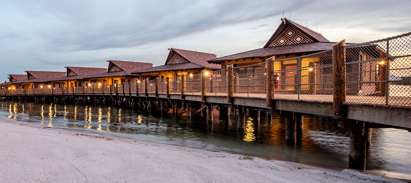
So how do you handle a grey and gloomy day? I wish there was a touch of blue in the sky to bring this out...the grey nature of the sky really makes it difficult. I tried putting something in the foreground to give it a bit more UMPH. Fire away

i-St6C8Dq-XL.jpg

Here's what I envisioned B&W... (some halo effects due to being a bit sloppy on the adjustment brush).

i-SptPZsN-XL.jpg
 

ok, let's get some feedback on this portrait:

Contemplating at the beach by Adam Brown, on Flickr


I agree that there's not much to be critical of here. I would say that the areas where you would expect sharp focus seem a little soft, but that could just be my eyes. However, soft works beautifully in portraits. Did you use fill light on the shadow side of her face or did you do some recovery there? There is a strange green fringing in the leaves between her legs, but it's hardly noticeable.

Sort of on topic, but, what type of focus adjustments have you had to make for this lens?

I'll have to check the focus adjustment next time the camera is in hand.

I was shooting with a super narrow DOF and wide aperture, so there is some softness. Some images were too soft if I missed focus by more than a couple millimeters. I was ok with the focus on this shot. If I had stopped down to 2.8, the whole image would be sharper, but I would have lost some of the background separation.

And while the Nikon 85/1.8 is an absolutely marvelous lens, and a great value --you do get some color fringing at wide apertures. I wasn't always able to correct it in post.

I did lift shadows in post. The dynamic range on the d750 is really outstanding. I also had someone holding a reflector for fill, but I don't remember if the reflector was used in this shot. (The model's agent said he would stay back and out of the way, but instead I put him to work with the reflector).
 
/
This is from an old photo of Pemaquid Light at twilight in the fog. Since I am lower than a novice in post skills, I am hoping your criticisms/suggestions will help learn. Thanks in advance.

rr5v75.jpg
 
This is from an old photo of Pemaquid Light at twilight in the fog. Since I am lower than a novice in post skills, I am hoping your criticisms/suggestions will help learn. Thanks in advance.

rr5v75.jpg

Not sure if it's salvageable, but first attempt would be the newish dehaze feature in Lightroom. It works pretty well.
Next step would be some sort of detail enhancement -- I've used Topaz detail. Or unsharp mask in Photoshop (not sure why it's call unsharp if it sharpens).
For truly advanced skills, work with a few layers in Photoshop.

As it stands, you could also try tone mapping-- while many people don't like that overprocessed HDR look, it can sometimes be used to make an otherwise drab photo stand out.
 
@Chernabog1940 tried playing around with the photo in Lightroom - just not enough information on the file to do much. What camera was this taken on?
 
I agree, not much to work with there. Maybe for extreme cases like this upload of a raw file to a place like dropbox would be helpful.

My contribution.. Have at it.
24559787572_a68f683f4c_h.jpg
 
This is from an old photo of Pemaquid Light at twilight in the fog. Since I am lower than a novice in post skills, I am hoping your criticisms/suggestions will help learn. Thanks in advance.

rr5v75.jpg


I took a stab at it trying to set a foggy, dark mood.

i-8hzVTBZ-XL.jpg


My question is; what is the subject? Is it the bell or the lighthouse? I would have focused on one or the other and make it stand out. You could have done a close up of the bell with a wide aperture and have the lighthouse blurred in the background, or you could have gone wider with the Lighthouse as the subject, etc. As it stands it's a bit confusing and frustrating because as I viewer I want to see more.
 
Thanks for all your help! I found this pix in an old box of pictures so it was probably taken with a P&S camera.

Here is a more recent shot of the same lighthouse. The is not the 'usual' point of view.

iqbubc.jpg
 
I agree, not much to work with there. Maybe for extreme cases like this upload of a raw file to a place like dropbox would be helpful.

My contribution.. Have at it.
24559787572_a68f683f4c_h.jpg

Is that a stitched panorama? It's excellent. Very very slight criticism, if you could have the whole thing turned sightly to the left... get a bit more of the building on the left side, instead of the empty space on the right side. But really, it's an excellent image.
 
Thanks for all your help! I found this pix in an old box of pictures so it was probably taken with a P&S camera.

Here is a more recent shot of the same lighthouse. The is not the 'usual' point of view.

iqbubc.jpg

I like foreground context in landscape shots. So the blowers are nice. But it still would benefit from a tighter crop, and getting lower to the ground for a more interesting perspective.
 
Is that a stitched panorama? It's excellent. Very very slight criticism, if you could have the whole thing turned sightly to the left... get a bit more of the building on the left side, instead of the empty space on the right side. But really, it's an excellent image.

It's a crop of a single 3:2 shot at 15mm. I pasted the original below. I thought the crop was more interesting. Speaking of stitching, I have one panorama made from 20 images from my 24mp A7II, but it crashes my browser each time I try to open the full size version. :)

i-tXBQ3Fb-X2.jpg
 
It's a crop of a single 3:2 shot at 15mm. I pasted the original below. I thought the crop was more interesting. Speaking of stitching, I have one panorama made from 20 images from my 24mp A7II, but it crashes my browser each time I try to open the full size version. :)

i-tXBQ3Fb-X2.jpg

Yes, I like the crop you did, and there are a few other interesting ways you could have cropped it. I *might* bring out more detail in the sky, but that is subjective, it could become overdone. Nice job.
 
This is from an old photo of Pemaquid Light at twilight in the fog. Since I am lower than a novice in post skills, I am hoping your criticisms/suggestions will help learn. Thanks in advance.

rr5v75.jpg

Interesting, as there is not much information on this photo that will allow PP to help...just from a composition standpoint I think I would get rid of the red house on the left and focus in on the Foggy Lighthouse. This would be difficult to do with "little" digital information.

Thanks for all your help! I found this pix in an old box of pictures so it was probably taken with a P&S camera.

Here is a more recent shot of the same lighthouse. The is not the 'usual' point of view.

iqbubc.jpg

I would like the see the flag moved to the left in the photo a bit more...I find it distracting in front of the actual lighthouse. I do like the colorful flowers in foreground, If you took 4-5 steps to the right in this photo, I am curious to see the results.


Receive up to $1,000 in Onboard Credit and a Gift Basket!
That’s right — when you book your Disney Cruise with Dreams Unlimited Travel, you’ll receive incredible shipboard credits to spend during your vacation!
CLICK HERE


DIS Facebook DIS youtube DIS Instagram DIS Pinterest

Back
Top