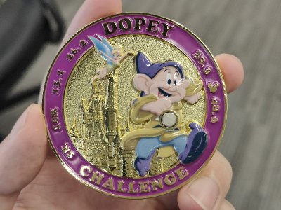
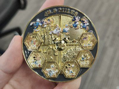
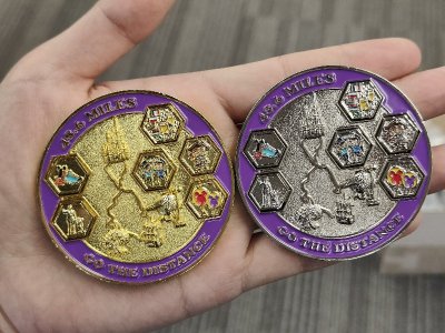
? Challenge Coin - Need help with Design ?

I agree with the gold metal colored map. Are you still going to have a way to attach the little medals to the front? It is one of my favorite aspects of the coin.

I also like Go the Distance.

I adore my challenge coin and have it sitting on my desk next to me all the time (It's a place holder on my calendar). I kinda regret not getting a second one for my husband (he might be a little jealous of it). But we'll both be there for Dopey races and he can get one then. : )

i will probably just have them magnetize the entire coin or see if they can make the mini medals.be magnetized so they can just attach to the front. it wont be as strong as before...probably....but i cant figure out another way to make them attach without adding some small magnet that really stands out visually - i want to avoid that obvious magnet like i had on the first coin.

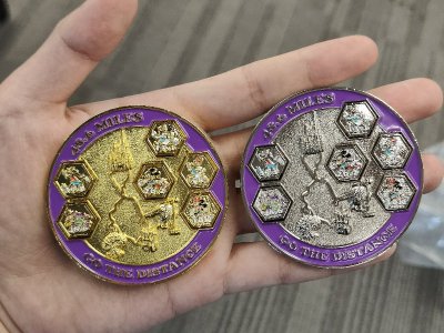
thx. Go The Distance is the text now on back, also will do metal colored map on back.

january you can get another one. :)
 
View attachment 989534

I would like some advice on a couple more things - this time the back of the coin.

1) What should the text be at the bottom. Initially I had "Every Mile is Magic" but that's the same message the one guy has on his coin - didn't want to just copy that.

Give me options...these are some I had: WISH UPON A STAR
EVERY MILE IS MAGIC
EVERY MILE IS PAIN
DREAM DARE DO
FAILURE IS NEVER QUITE SO FRIGHTENING AS REGRET

View attachment 989536

I like the quote "Failure is never quite so frightening as regret" but dang that is long and it just wont look good on the bottom.

2) I temporarily added Jack Sparrow to the bottom of the course - but it is odd just to have one character and so I don't know if it is worth it or what else to add. Tried adding the monorail to the middle but it didn't come out good. Maybe less is more and just leave it off. I also though of adding a couple of Princesses running.

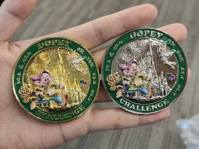
3) The color of the course - someone suggested making it be the metal color,

Here is what a silver version could look like
View attachment 989537

And here is a version if I don't have colored parks or course, but instead make the metal colored.
View attachment 989538
Good point about omitting the "2025" so that you aren't limiting the medal to a single year.
I *like* the multi-color parks, but wouldn't be terribly upset at the metal-color parks.
IMHO, "Every Mile is Magic" is used widely enough that also having it on your medal is a non-issue.
Or maybe "I get to run!" (Look for that on some shirts that I've ordered and that I hope will show up in a week or so).
I like the idea of a few characters on the course. JJS is a good choice. Maybe also have Mr Incredible out there....


Receive up to $1,000 in Onboard Credit and a Gift Basket!
That’s right — when you book your Disney Cruise with Dreams Unlimited Travel, you’ll receive incredible shipboard credits to spend during your vacation!
CLICK HERE


New Posts


DIS Facebook DIS youtube DIS Instagram DIS Pinterest DIS Tiktok DIS Twitter

Back
Top