- Joined
- Jan 3, 2001
- Messages
- 9,214
Concept art was much better. The colors are so much more drab vs the saturation we were shown in the artwork. Comes off as very beige. Hopefully its just a bad photoGrand Hall got some tweaks from the concept art for the Treasure:
View attachment 908218
View attachment 908220
I really like it. On another Treasure Facebook group I saw a video that gives you a much better feel for it and think it looks great! There is some dark wood trim in different areas that I really like. I can't wait to get on the ship in May!I mich prefer the concept art. I loved that they dared to go dark. It looked so exotic. I also loved the blue and greens and find the rusty pattern on the carpet not attractive at all.
The concept art reminded me of the Adventureland room at Walt’s at DLP. This now looks like a few ornate elements thrown onto the standard design. The only improvement is the chandelier. Really like that!
I like both versions, and I love the actual chandelier.Grand Hall got some tweaks from the concept art for the Treasure:
View attachment 908218
View attachment 908220
I hope it’s just the photo and that it looks better in real life. But for me that’s the worst change.I don’t like that orange in the carpet at all. I didn’t love the concept art but I think they could have brightened it without all the orange.
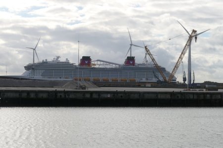
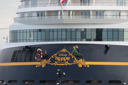
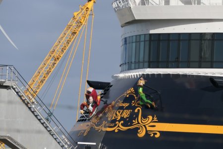
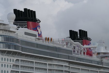
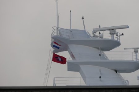
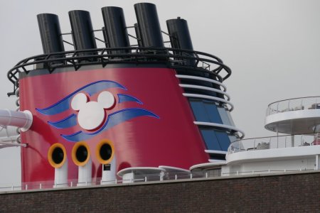
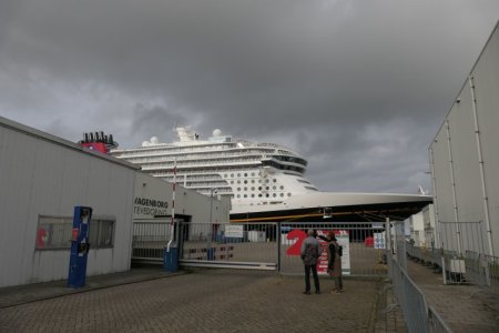
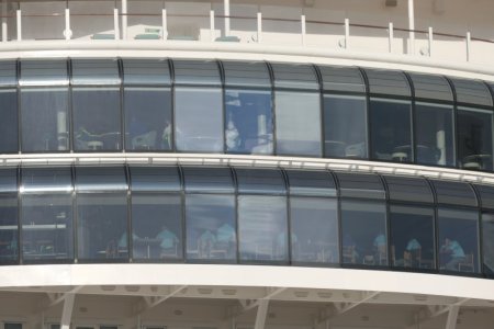
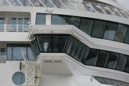
Thanks for sharing! I bet a lot of the staff is drawn from all across the fleet.Ok, here are some more pictures from the Disney Treasure in Eemshaven.
View attachment 908319
View attachment 908320
View attachment 908322
View attachment 908321
Dutch flag
View attachment 908325
Funnel and some beach chairs to the right
View attachment 908326
View attachment 908328
This gate was as close as I could get to the ship.
View attachment 908331
Staff is on board, in uniform
View attachment 908323
View attachment 908329
Always a smart move!I'm looking forward to seeing the ship in person. Trying not to judge based on pictures before that.
I mich prefer the concept art. I loved that they dared to go dark. It looked so exotic. I also loved the blue and greens and find the rusty pattern on the carpet not attractive at all.
The concept art reminded me of the Adventureland room at Walt’s at DLP. This now looks like a few ornate elements thrown onto the standard design. The only improvement is the chandelier. Really like that!
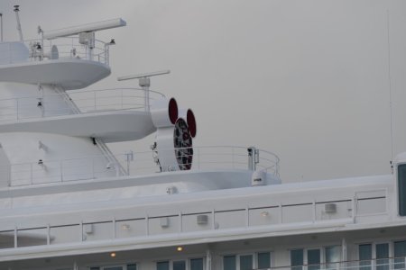
What is this supposed to be?
Looks like stage lights to me.What is this supposed to be?
Not 100% sure, but I think it is the ship's horns. I'll see I have a more zoomed in picture.What is this supposed to be?
Ship's hornWhat is this supposed to be?
Interesting. On the older ships, they used to be kind of hidden in one of the funnels from what I remember.Ship's horn
Wish class has the Mickey shaped cluster of horns. Magic & Dream class have the row of horns on the forward side of the forward funnelInteresting. On the older ships, they used to be kind of hidden in one of the funnels from what I remember.
