-
You are using an out of date browser. It may not display this or other websites correctly.
You should upgrade or use an alternative browser.Marathon Weekend 2026
- Thread starter FFigawi
- Start date
Naomeri
DIS Veteran
- Joined
- Oct 14, 2019
- Messages
- 5,990
SAFD: I've never experienced the unpainted runDisney medals, but I'd really like to. I don't want them to go back to the days where the medals were basically the same from year to year though! I don't see why they can't have monochrome medals with just accents of enamel, instead of all over enamel paint, and no shiny finish on the metal parts--that gets too many fingerprints.
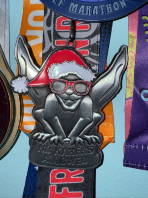
These are the style I want (but they don't all have to be the same base metal)
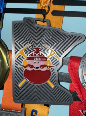
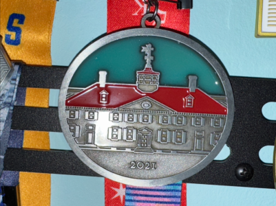
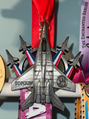
fatmanatee
DIS Veteran
- Joined
- Jul 25, 2017
- Messages
- 4,490
SAFD: I’m always in favor of simplifying things here. There’s been some chatter that the velcro (??????) they used for one of the DL medals is kinda weak so people are getting warned to treat them carefully so nothing breaks. It doesn’t have to be this way! Don’t mind the color, but a lot of times the “features” are excessive.DisneyParrothead
DIS Veteran
- Joined
- Dec 22, 2010
- Messages
- 1,493
The 10k part on the Cruella medal is on springs, and the medal at the expo was missing that part. I guess so many people handled it and it broke. I’m being super careful with mine.SAFD: I’m always in favor of simplifying things here. There’s been some chatter that the velcro (??????) they used for one of the DL medals is kinda weak so people are getting warned to treat them carefully so nothing breaks. It doesn’t have to be this way! Don’t mind the color, but a lot of times the “features” are excessive.
fatmanatee
DIS Veteran
- Joined
- Jul 25, 2017
- Messages
- 4,490
That’s crazy, I always thought that they were playing with fire with these springs.The 10k part on the Cruella medal is on springs, and the medal at the expo was missing that part. I guess so many people handled it and it broke. I’m being super careful with mine.
In related news (today’s challenge medal)…

Herding_Cats
DIS Veteran
- Joined
- Aug 3, 2017
- Messages
- 5,885
SAFD:
I understand why they keep doing the moving parts on the medals, but I don’t need it in most of them. Once you hang the medal, it almost never gets touched again, and it really only serves as a weak point where things can break. The light up feature is just a waste IMO. The light-up dopey medal never worked for me, and again, once you hang these up it’s never getting touched again.
The exception to the “no moving parts” is the 2022 medals. I really enjoyed that it was less of a front/back spinner.
I’m nervous that they’ll lean too hard into the genre/book idea for the upcoming race weekend, while simultaneously hoping for a medal that doesn’t closely resemble the ones I already have. Clear as mud, eh?*DisneyDreamer
DIS Veteran
- Joined
- Jan 16, 2007
- Messages
- 1,808
I agree. I definitely prefer medals without the moving parts. I was thinking the same thing about hoping they don’t use the book theme too literally for the medals for Marathon Weekend. I’m picturing medals that hinge open like books which I really don’t need or want.SAFD:
I understand why they keep doing the moving parts on the medals, but I don’t need it in most of them. Once you hang the medal, it almost never gets touched again, and it really only serves as a weak point where things can break. The light up feature is just a waste IMO. The light-up dopey medal never worked for me, and again, once you hang these up it’s never getting touched again.
The exception to the “no moving parts” is the 2022 medals. I really enjoyed that it was less of a front/back spinner.
I’m nervous that they’ll lean too hard into the genre/book idea for the upcoming race weekend, while simultaneously hoping for a medal that doesn’t closely resemble the ones I already have. Clear as mud, eh?jrsharp21
DIS Veteran
- Joined
- Dec 9, 2006
- Messages
- 2,028
SAFD: I agree with most people on here, don't need the gimmicky medals. I like clean one piece medals without moving parts. The medal that FFigawi posted would be ideal, without the spinner. Give me a medal similar to that, and then on the back inscribe the race and the year, and I would be good. It would make it so much easier to pack the medals and also take them out at the park while taking pictures.marty3d
Discovering what lies beyond the fifth dimension
- Joined
- Dec 30, 2000
- Messages
- 2,652
SAFD: In terms of moving parts - mostly agree - with the exception of the Tower of Terror medal with the moving elevator - because that made complete sense.
And I agree with @Herding_Cats about the 2022 medals - I liked the movement on those. They are also my favourite runDisney medals because I feel they balance the look of a more traditional medal with a nice splash of color.
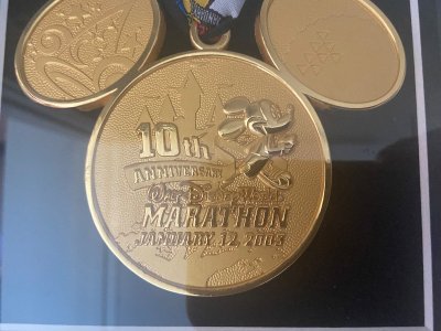
What do I never want to see again? The 2023 30th anniversary medal for the marathon and the 10th anniversary Dopey.Zutroy
DIS Veteran
- Joined
- May 3, 2022
- Messages
- 524
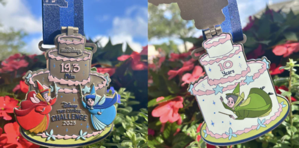
I think this year’s W&D medals represent everything wrong with modern RD medals. Gimmicks for the sake of gimmicks that add nothing. Oh, the challenge medal is a cake! What could be under that cake? Why, another cake! This thing is going to be clapping and chipping all the paint off the inside of the medal. So stupid.
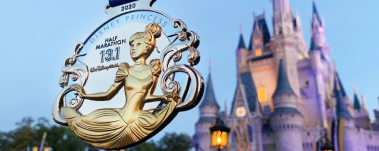
The 2020 Princess medal is my all time favorite design and theming. No paint. No gimmicks. Just great design and use of space. It’s just sad seeing how bad most of the medals have been recently, reusing the same art assets and putting springs, spinners, lights, etc. instead of just making a good looking medal.
Baloo in MI
I don’t have to, I get to.
- Joined
- Jan 28, 2015
- Messages
- 2,408
SAFD:
You can put me in the less is more camp. I like a more toned down medal - less chance of it getting scratched or breaking. Plus my favorite part of the medal is wearing it around the parks after the race - it is just fun. But the past few years the medals have gotten heavier and all the movement/things they do seem to lead to my runDisney shirt or jacket I am most likely wearing getting beaded up or something.
My favorite medal is the 2017 marathon medal.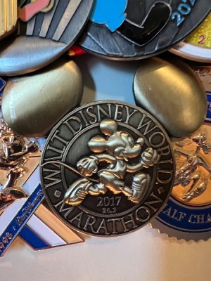
I love the shape, celebrates the event, was kind to my clothes and felt very Disney to me.Stitch&Co.
Mouseketeer
- Joined
- Jan 4, 2022
- Messages
- 257
SAFD: My first medal is from W&D 2021 with the sparkly “liquid” test tube. Love that one for both the color and shape of the medal. Spinners are generally not that impressive to me. There are a couple that I like, W&D 2022 Half (Soul with 4 separate spinners) and 2023 10K (friends from Beauty & the Beast) where each side is a different color with different characters so it gives a dramatically different look to the medal. But most of the time moving pieces just give you something that can break. Anything light up is just too gimmicky to me. I guess I’m just used to the highly colored medals and the older styles just look a bit too plain. They are nice but my 2022 half medal almost looks out of place compared to the others. I just don’t know that Disney will go back to the older less colorful style of medals now.
As for this years medals I don’t see them leaning too heavily on the book theme itself. I think we’ll see the individual themes more so than anything directly related to books. Just please don’t give us anything like that Moana medal from PW 2022. That was huge and ugly.Last edited:3princesandaprincess
Mouseketeer
- Joined
- Jan 2, 2008
- Messages
- 122
SAFD: I’m not particularly picky about what the medals look like. I’d appreciate some that hold up better than the current ones do. I also appreciate some variance from year to year. But colors, and spinners don’t really matter. The race isn’t really about the medal for me. Which probably answers the bonus - it’s wall worthy bc I ran it (half or more - 5 & 10 k maybe a cool medal or PR).Last edited:fatmanatee
DIS Veteran
- Joined
- Jul 25, 2017
- Messages
- 4,490
I really wouldn’t mind throwing it back to this one at some point. Maybe you modernize it somehow, but for example the one I got for NYC last year is becoming one of my favorites and it’s very simple:SAFD:
You can put me in the less is more camp. I like a more toned down medal - less chance of it getting scratched or breaking. Plus my favorite part of the medal is wearing it around the parks after the race - it is just fun. But the past few years the medals have gotten heavier and all the movement/things they do seem to lead to my runDisney shirt or jacket I am most likely wearing getting beaded up or something.
My favorite medal is the 2017 marathon medal. View attachment 1002240
I love the shape, celebrates the event, was kind to my clothes and felt very Disney to me.
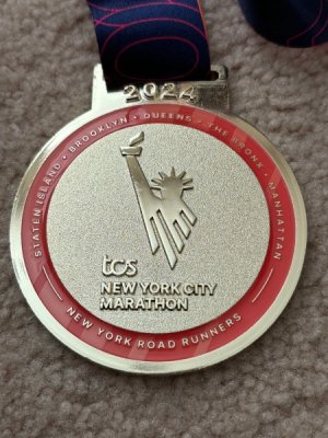
Nothing fancy, just a nice gold with small color accents and it pops.JackosinDIS
DIS Veteran
- Joined
- Jun 15, 2023
- Messages
- 1,713
SAFD: they could probably consider making them out of gold. I’d like that.pluto377
DIS Veteran
- Joined
- Jan 17, 2011
- Messages
- 1,137
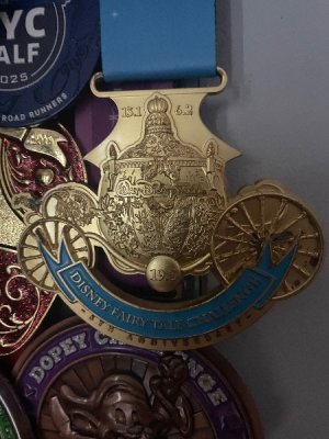
SAFD- generally I like more simple medals. I don’t need all the special effects. I do like a bit of color. I really prefer when there’s a consistent shape through the weekend too, preferably circular. Like the 2019 dopey set is all circles just getting progressively larger as the race distance increases.
This is one of my faves even thought it’s not circular.Attachments
Barca33Runner
Please excuse the crudity of this model
- Joined
- Feb 27, 2014
- Messages
- 2,603
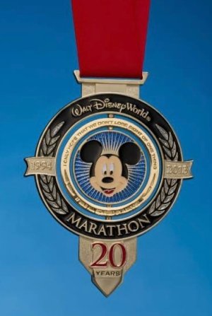
SAFD: It is serendipitous that my first Marathon is still my favorite medal, the previously pictured 2013 20th Anniversary medal. The key to that medal is that all the spinners had a purpose and the medal was improved by their inclusion. The last few years they’ve just been adding stuff to add stuff. They don’t improve the medals and, in many cases, make them look cheaper. We don’t need a spinning acorn just to have something that moves (not their worst sin, but it jumped in my mind because it’s so silly and trivial).-
Bluey Merch Has FINALLY Arrived at Disney Parks
-
Press Play on Park Nostalgia with Disney Music Emporium Vinyl
-
New Disney x Marc Jacobs Tennis Capsule for Kids
-
Fun Finds to Shop Right Now at Disney's Animal Kingdom
-
Disney's Genie in Aladdin on Broadway Takes Final Bow
-
3 Disney World Restaurants That Are Part of the Attraction
-
ABC Pulls 'The Bachelorette' Just Days Before Premiere
New Threads
- Replies
- 0
- Views
- 5
- Replies
- 0
- Views
- 89
- Replies
- 1
- Views
- 124
- Replies
- 4
- Views
- 354
- Replies
- 8
- Views
- 383
- Replies
- 3
- Views
- 456
- Replies
- 0
- Views
- 265
Disney Vacation Planning. Free. Done for You.Our Authorized Disney Vacation Planners are here to provide personalized, expert advice, answer every question, and uncover the best discounts. Let Dreams Unlimited Travel take care of all the details, so you can sit back, relax, and enjoy a stress-free vacation.Start Your Disney Vacation
New Posts
- Replies
- 118
- Views
- 20K
- Replies
- 3
- Views
- 986
- Replies
- 5K
- Views
- 801K
- Replies
- 17K
- Views
- 1M
- Replies
- 15
- Views
- 4K
- Replies
- 46
- Views
- 2K
- Replies
- 0
- Views
- 5
- Replies
- 61K
- Views
- 3M
