Good morning Disney runners! While
@camaker is off enjoying his mountain retreat, I'll kick off this week's
SAFD.
Since we're all still (not so) patiently awaiting our reveal,
what are you hoping for in this year’s MW medal designs?
Do you love spinners, bright colors, oversized medals, … or would you prefer that rD backs off on some of those trends?
Any elements from past years you’d like to see again (or never again)?
Bonus: What would make a medal truly “wall-worthy” for you (rD or otherwise)?
My SAFD response: I don't mind some variations to keep with the theme, but would prefer quality over gimmicks and paint. I love a spinner, some selective color, or a clever design element, but it seems rD suppliers just can't seem to get the quality control nailed down. I'd rather they keep it simple and everyone get nice looking bling. If they want to get creative, play with shapes!
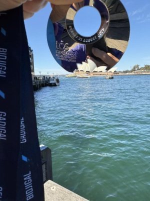
I really loved the Sydney Marathon medal this year with the Opera House cutout. Can you imagine this with the castle or Spaceship Earth? The marathon medal could have four cutouts around the edges for all four park icons! (Though MCO TSA might not love us bringing essentially throwing stars through security.

)

Bonus: I put all my medals up on wall hangers, so the only thing that makes one wall-worthy for me is that I did the race.

 Kind of not expecting them until the week after next at the earliest now. If they stick with the “Medal Monday” reveal, next Monday would be to celebrate Halloween Half Weekend so looks like we’ll still be waiting a couple weeks.
 )
)


