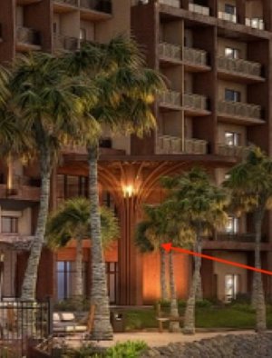
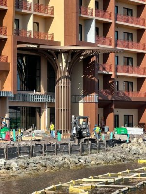
I mean I get it….but it still looks awful. Imagine if the grand had 80% beautiful white balconies, and then 20% were black iron with glass. No other Disney hotel does this for a reason. It just looks out of place. It kind of reminds me of building a
Lego set where everything is going perfectly, and then towards the end you realize you’re missing some pieces, so you sort of throw it together with pieces from another Lego set even if they might be the wrong color.
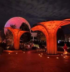
Still love the tower coming to PVB, and I can’t wait to stay there in February, but there are just a few things with the design (exterior and interior) that leave me asking “but why?”