-
You are using an out of date browser. It may not display this or other websites correctly.
You should upgrade or use an alternative browser.Marathon Weekend 2025
- Thread starter FFigawi
- Start date
azrivest
Chasing the rDream
- Joined
- Jul 15, 2020
- Messages
- 2,233
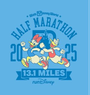
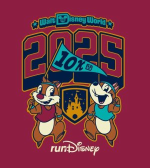
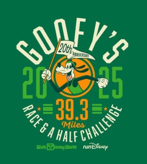
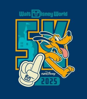
Me too, same exact feeling. "Just" the marathon it is for me in 2025 thenI'm not a fan of the Goofy/Dopey art, but I actually really like the M artwork. Red isn't really my color, but the style works for me!
jenljeffers1989
Mouseketeer
- Joined
- Jul 15, 2021
- Messages
- 182
Yeah, I like this soooo much better than 2023's color scheme, which I hated. I liked last year's better than this year though.Looooove the muted colors and retro feel of a few of the distances. Looking forward to seeing what some of the merch looks like.Herding_Cats
DIS Veteran
- Joined
- Aug 3, 2017
- Messages
- 5,888
lookingforsunshine
it never hurts to keep looking for sunshine
- Joined
- Dec 6, 2021
- Messages
- 1,451
I like the 5k, 10k, and marathon art. I am torn on what to do for next year. MW is the best for me logistically but am not certain about it. I also entered the NYC marathon lottery (with little hope of getting in but still).superchime
DIS Veteran
- Joined
- Jun 21, 2010
- Messages
- 839
I like the 5k and 10k designs the best, and the marathon art is ok. I'm not completely in love with the Dopey design, so if I "just" run the marathon this year I won't feel like I missed out.Disneyhanna
DIS Veteran
- Joined
- Nov 29, 2017
- Messages
- 2,190
The runDisney blog post has the same colors as the Instagram post. So weird. Which do we like better?
Herding_Cats
DIS Veteran
- Joined
- Aug 3, 2017
- Messages
- 5,888
I get that it's a "retro" theme (feels like 70s to me?) but it also feels.....boring. Like it's a kids' coloring book page again, which is one of the things I didn't like about this year's princess artwork (not that I ran princess, but still.)
ALSO, if you're a person who likes to get a drawing from Art of Disney, as of this year they had started having weekend-specific sketches that we the same as the artwork that was released for the race weekend. The CM made it sound like that's how they would be doing race weekend sketches going forward. And I'm sooooo not interested in seeing someone try to make these images into animation-style drawings.
I like the insta artwork for the half and goofy a lot more than the website ones.....Really, I just don't want a 4th yellow/orange goofy shirt. Last edited:
GollyGadget
DIS Veteran
- Joined
- Feb 15, 2017
- Messages
- 2,331
I don't hate it but I'm not head over heels in love. Just kind of meh. The Instagram pics are slightly more appealing to me, especially for the half.Aaaaand I don't like the artwork.
Proof of time must be provided by the participant for each individual race from an officially timed 10K, 12K, 15K, 10-Mile, Half Marathon or Marathon race reflecting results within the last two (2) years.
I'm so confused. Are they accepting 12 & 15K or not?Full Marathon Proof of Time: Results for a 10-Mile, Half Marathon or Marathon
Half Marathon Proof of Time: Results for a 10K, 10-Mile, Half Marathon or MarathonHerding_Cats
DIS Veteran
- Joined
- Aug 3, 2017
- Messages
- 5,888
same.I don't hate it but I'm not head over heels in love. Just kind of meh. The Instagram pics are slightly more appealing to me, especially for the half.
I think it's confusing as well. Maybe they will for "just" a half? Seems like 10mi is the shortest they'll take for the M or challenges. Might be worth an email to trackshack....I'm so confused. Are they accepting 12 & 15K or not?Cabius
More Disney-obsessed than is healthy.
- Joined
- Nov 22, 2017
- Messages
- 1,578
I spent a minute trying to figure out what the M color scheme reminded me of (and to a lesser extent the 5k and 10k). Then it hit me: it's the teal-and-orange pairing that was used by ~every movie made between 2001 and 2015.
https://priceonomics.com/why-every-movie-looks-sort-of-orange-and-blue/fatmanatee
DIS Veteran
- Joined
- Jul 25, 2017
- Messages
- 4,494
It def feels like they're going to the retro well again. Would guess that after 2023 blew up, they mapped out a bunch of other ideas that they can use. Like I can see them one day doing something with the 60s, 70s, or 80s. IMO this vibe is just "varsity retro".I get that it's a "retro" theme (feels like 70s to me?) but it also feels.....boring.
I like it BTW. No strong feelings but it's decent.The Expert
Has been to every Disney park in the world
- Joined
- Nov 8, 2009
- Messages
- 5,529
REALLY hoping for this!Seems like a letterman's style jacket would be an easy lay-up for the weekend jacket, but having seen Disney merchandise that might be too optimistic.
I do Dopey in spite of disliking the character and usually the artwork. But I agree, this is actually kind of cute!this Dopey art is the only art that has ever made me even for a second consider doing DopeDisneyhanna
DIS Veteran
- Joined
- Nov 29, 2017
- Messages
- 2,190
Here are the side by side comparisons, left side is social media and right side is the runD marathon weekend website. Sorry for the potato quality lol! I think past weekends have had different colors between posts but I don’t remember which usually ends up being the closest to what ends up on the shirts when that’s happened.
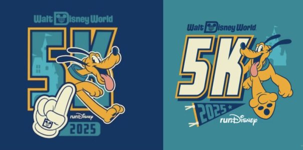
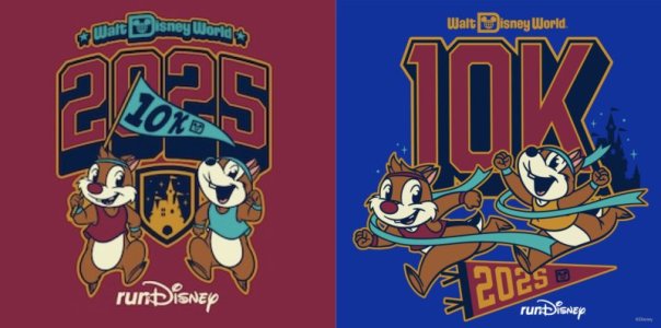
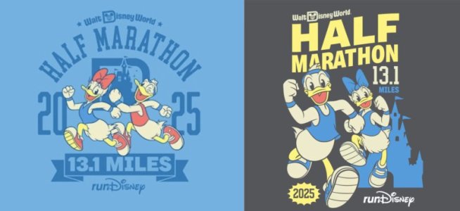
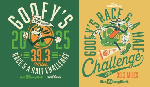
DisneyMountainWoman
DIS Veteran
- Joined
- Aug 14, 2013
- Messages
- 2,554
I really like it. I did not like last years look much. I love the old school vintage vibe. And soo excited chip and Dale for 10k!! The Dopey is my fav of the designs. I loove the pastel purple and green color combo. I am so excited this will be my first Dopey!fatmanatee
DIS Veteran
- Joined
- Jul 25, 2017
- Messages
- 4,494
The half mismatch is WEIRD. IG post looks like a better fit with the theme.-
New Tie Dye PIN Series With Favorite Disney Characters
-
Why Your Kids Might Actually Prefer a Disney 'No-Park' Day
-
The Four New Disney Loungeflys You Missed This Week
-
Highlights from Bluey's Best Day Ever at Disneyland
-
Manage every guest touchpoint in one elegant platform, and reveal your wedding in true Disney style
-
3 Kid-Friendly Disney Springs Spots Your Family Will Love
-
Bluey Merch Has FINALLY Arrived at Disney Parks
New Threads
- Replies
- 11
- Views
- 177
- Replies
- 0
- Views
- 90
Disney Vacation Planning. Free. Done for You.Our Authorized Disney Vacation Planners are here to provide personalized, expert advice, answer every question, and uncover the best discounts. Let Dreams Unlimited Travel take care of all the details, so you can sit back, relax, and enjoy a stress-free vacation.Start Your Disney Vacation
New Posts
- Replies
- 7K
- Views
- 223K
- Replies
- 17K
- Views
- 1M
- Replies
- 16
- Views
- 987
- Replies
- 9K
- Views
- 1M
- Replies
- 184
- Views
- 43K
- Replies
- 13K
- Views
- 803K
