You are using an out of date browser. It may not display this or other websites correctly.
You should upgrade or use an alternative browser.
You should upgrade or use an alternative browser.
? Challenge Coin - Need help with Design ?
- Thread starter Z-Knight
- Start date
Baloo in MI
I don’t have to, I get to.
- Joined
- Jan 28, 2015
- Messages
- 2,401
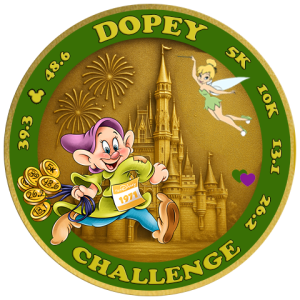
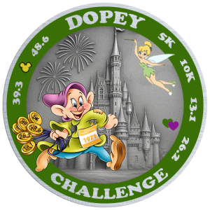
The fireworks was a great suggestion and looks very good. I might be in the minority but I think the silver looks nice, it does make the green really pop. You have real talent!
Naomeri
DIS Veteran
- Joined
- Oct 14, 2019
- Messages
- 5,919
I agree, the silver looks really nice, all the colors stand out more.The fireworks was a great suggestion and looks very good. I might be in the minority but I think the silver looks nice, it does make the green really pop. You have real talent!
Z-Knight
DIS Veteran
- Joined
- May 3, 2015
- Messages
- 1,968
it's allllll ChatGPT - well, on the castle at least. The rest is alllll me....well, and Disney cartoonists.The fireworks was a great suggestion and looks very good. I might be in the minority but I think the silver looks nice, it does make the green really pop. You have real talent!

The Expert
Has been to every Disney park in the world
- Joined
- Nov 8, 2009
- Messages
- 5,403
Okay but is it wrong if I kinda DO want this?? That Tink with Carissa's head is
And I like the silver more than I thought I would. I still kinda like the gold more, but wouldn't be disappointed with either version.
GuinnessRunner
DIS Veteran
- Joined
- May 16, 2018
- Messages
- 738
Put me in the silver camp as well. Great work on these!
marty3d
DIS Veteran
- Joined
- Dec 30, 2000
- Messages
- 2,555
And maybe we replace Dopey's head with John Pelkey - throw in Jogging Jack on the course in the back .... would be a very niche coinOkay but is it wrong if I kinda DO want this?? That Tink with Carissa's head is

Z-Knight
DIS Veteran
- Joined
- May 3, 2015
- Messages
- 1,968
oooh...yeah i could put some Easter eggs on the back because there is room.And maybe we replace Dopey's head with John Pelkey - throw in Jogging Jack on the course in the back .... would be a very niche coin
Herding_Cats
DIS Veteran
- Joined
- Aug 3, 2017
- Messages
- 5,830
you're just saying that because it makes it very MSU-y.The fireworks was a great suggestion and looks very good. I might be in the minority but I think the silver looks nice, it does make the green really pop. You have real talent!

AtomicFrog
Always up for WDW
- Joined
- Nov 12, 2017
- Messages
- 70
I like the gold coin…. but I’m from Louisiana… so purple, green and gold just go together for us  .
.
 .
.Mr_Incr3dible
50 miles at 55!
- Joined
- Jul 27, 2021
- Messages
- 1,848
Dude! I think you nailed it! The addition of Tink and the fireworks is great.
I think I prefer the gold, but the silver looks good as well.
I get 1971 as the year that WDW opened, but I don't think I see "2025" anywhere?
Or is there the potential to do an inscription around the outside perimeter of the coin? On the edge itself, not on the obverse or reverse? You could put the year there and maybe some other text. Just a thought.
Z-Knight
DIS Veteran
- Joined
- May 3, 2015
- Messages
- 1,968
i dont want to add a current year to the actual coin becuase i would like to give them out in the future as well and it costs a lot to make a new design each year...so currently will have 2 variations if you count last years version but really 3 since i will probably get half silver half gold made.Dude! I think you nailed it! The addition of Tink and the fireworks is great.
I think I prefer the gold, but the silver looks good as well.
I get 1971 as the year that WDW opened, but I don't think I see "2025" anywhere?
Or is there the potential to do an inscription around the outside perimeter of the coin? On the edge itself, not on the obverse or reverse? You could put the year there and maybe some other text. Just a thought.
i had thought about making a mini medal , hexagonal one on the back, that could have a year in it but that too would add to my cost to get separately produced.
i still may want to add a ribbon across the front that is some flat space where the mini medals from the back could rest but havent figured it out yet. last coin had the obvious place where the mini medals attached on the front and i decided to add similar mini medals on the back of this new design. but i haven't figured out how or where they would be placed on the new coin...not sure if i need to, per se, but those are.my current thoughts.
also trying to figure out what easter eggs to add on back...i thought of adding a little jack sparrow but didnt just want to add one "egg" unless i could have like 3 or more. so still debating things. i will hopefully have near final design by end of friday so i can then start the order process by end of weekend
Erika10021
Mouseketeer
- Joined
- Apr 15, 2024
- Messages
- 212
Oh my gosh, I love the new medal design!! The, map and fireworks are excellent additions. I am leaning towards the gold but either would be glorious.
Now I even more excited about doing Dopey!
Now I even more excited about doing Dopey!
Herding_Cats
DIS Veteran
- Joined
- Aug 3, 2017
- Messages
- 5,830
Z-Knight
DIS Veteran
- Joined
- May 3, 2015
- Messages
- 1,968
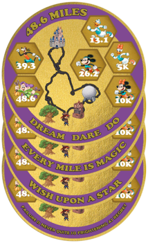
I would like some advice on a couple more things - this time the back of the coin.
1) What should the text be at the bottom. Initially I had "Every Mile is Magic" but that's the same message the one guy has on his coin - didn't want to just copy that.
Give me options...these are some I had: WISH UPON A STAR
EVERY MILE IS MAGIC
EVERY MILE IS PAIN
DREAM DARE DO
FAILURE IS NEVER QUITE SO FRIGHTENING AS REGRET
I like the quote "Failure is never quite so frightening as regret" but dang that is long and it just wont look good on the bottom.
2) I temporarily added Jack Sparrow to the bottom of the course - but it is odd just to have one character and so I don't know if it is worth it or what else to add. Tried adding the monorail to the middle but it didn't come out good. Maybe less is more and just leave it off. I also though of adding a couple of Princesses running.
3) The color of the course - someone suggested making it be the metal color,
Here is what a silver version could look like
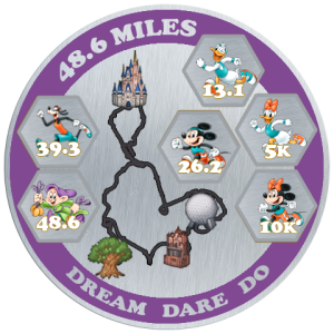
And here is a version if I don't have colored parks or course, but instead make the metal colored.

Naomeri
DIS Veteran
- Joined
- Oct 14, 2019
- Messages
- 5,919
What about "Go the Distance"?View attachment 989534
I would like some advice on a couple more things - this time the back of the coin.
1) What should the text be at the bottom. Initially I had "Every Mile is Magic" but that's the same message the one guy has on his coin - didn't want to just copy that.
Give me options...these are some I had: WISH UPON A STAR
EVERY MILE IS MAGIC
EVERY MILE IS PAIN
DREAM DARE DO
FAILURE IS NEVER QUITE SO FRIGHTENING AS REGRET
View attachment 989536
I like the quote "Failure is never quite so frightening as regret" but dang that is long and it just wont look good on the bottom.
2) I temporarily added Jack Sparrow to the bottom of the course - but it is odd just to have one character and so I don't know if it is worth it or what else to add. Tried adding the monorail to the middle but it didn't come out good. Maybe less is more and just leave it off. I also though of adding a couple of Princesses running.
3) The color of the course - someone suggested making it be the metal color,
Here is what a silver version could look like
View attachment 989537
And here is a version if I don't have colored parks or course, but instead make the metal colored.
View attachment 989538
The Expert
Has been to every Disney park in the world
- Joined
- Nov 8, 2009
- Messages
- 5,403
This is the correct answer.What about "Go the Distance"?
I also agree that less is more and the metal colored course looks best. This is going to be so good!
Z-Knight
DIS Veteran
- Joined
- May 3, 2015
- Messages
- 1,968
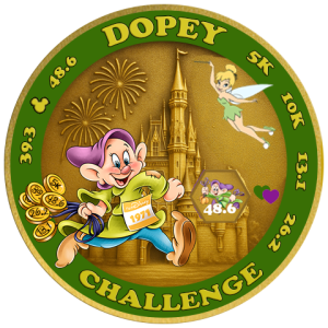
one last thing...this will probably also fall under the "less is more" category. last coin had a purpose to the mini medals...in that they would attach on front to dopey so he looks like he was wearing a medal. i didn't want to that this time because i didnt want to add a little circular medal that kind of sticks out. instead i was gonna make the coin be magnetic entirely and hence mini medals would still stick to the front. but im not sure i need to bother.
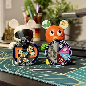
the other option was to make a separate slot on the front for the mini medal but that too would have resulted in a magnet being visible. so im scrapping that idea too..plus it would look too busy with it attached explicitly in its own slot. like this image
so....instead i think I'm nearly ready to order new coins....i have to make the high res images so will tonight.
if any of you still have inputs to the previous questions then please let me know.
the other option was to make a separate slot on the front for the mini medal but that too would have resulted in a magnet being visible. so im scrapping that idea too..plus it would look too busy with it attached explicitly in its own slot. like this image

so....instead i think I'm nearly ready to order new coins....i have to make the high res images so will tonight.
if any of you still have inputs to the previous questions then please let me know.
Last edited:
-
Chef Mickey's Debuts Adorable New Character Desserts
-
Mickey and Minnie Debut New Cruise-Inspired Looks at EPCOT DVC Lounge
-
Is the Magic - Disney's Oldest Ship - Still a Good Vacation Choice?
-
A Look at This Week's Last-Minute Disney Cruise Line Rates
-
New Special Menu for Gideon's Bakehouse in Disney Springs
-
Rock 'n' Roller Coaster Now Closed' New Disney's Hollywood Studios Map
-
Fun Facts About Walt Disney World Cast Members
New Threads
- Replies
- 6
- Views
- 975
- Replies
- 0
- Views
- 819
Disney Vacation Planning. Free. Done for You.

Our Authorized Disney Vacation Planners are here to provide personalized, expert advice, answer every question, and uncover the best discounts.
Let Dreams Unlimited Travel take care of all the details, so you can sit back, relax, and enjoy a stress-free vacation.
Start Your Disney Vacation

New Posts
- Replies
- 16
- Views
- 2K
- Replies
- 6K
- Views
- 682K
- Replies
- 11K
- Views
- 773K
- Replies
- 61K
- Views
- 3M
- Replies
- 11
- Views
- 921
Resort Thread
Jambo! Disney's ANIMAL KINGDOM LODGE
- Replies
- 10K
- Views
- 1M
- Replies
- 13K
- Views
- 772K
