AlexWyattMommy
<font color=deeppink>Okay, here I am, out of high
- Joined
- Feb 1, 2006
- Messages
- 20,808
I used wrong sized baggies too. 


This looks fun. I wasn't going to sign up, but now that I am sorting the holiday swap letters, I don't think I can resist.
Just a note -- please stress to every one to use the quart size bag to put all of their letters in. The sandwich size is not big enough and it has been a PITA trying to re-bag everything.
You said the bad word.


Question about these directions:
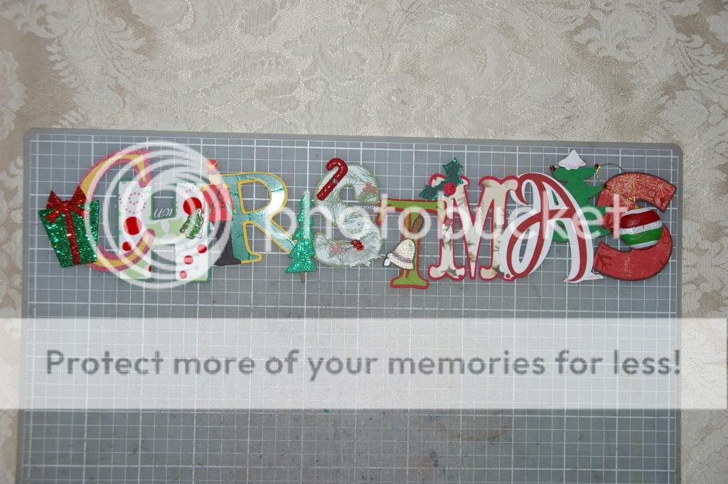
***IMPORTANT NOTE*** For Longer titles, please try to choose a font that is NOT WIDE. The Mickey Font Cricut Cartridge is a wide font for example so you wouldnt want to use that one. In addition, do not make any of your embellishments hang off the sides of your letter. For example: you can put a Mickey on the top of the letter or behind your letterbut NOT on the side hanging off the letter. This would cause the spacing between the letters in the word to need to be more spread out. If a swapper needs to overlap letters in a title for their page layout, having embellishments hanging off the sides makes it hard to do.
So in this photo here:

Only the I and 1st S are okay? The others all have stuff hanging off or are a wide font.
Most of these words are long. I really don't think any of these words will fit in a 12" space I am assuming it will have to go across 2 pages or at the top and bottom of one page.
thanks for the reminder....so just asking, if you where to have an "O" and wanted to use the Mickey ears behind it, would that be okay or do you think the ears would stick out to far on the sides?
Width: The tough one, because the fewer letters are in a word, the wider we can go. Take the word Contemporary. That is 12 letters, in order to fit across a two-page layout, the letters need to be smaller than 2” (24”/12 letters minus a little so there can be a gap between letters when they are laid out). But with Grand Floridian, you could theoretically put “Grand” at the top of a layout, and Floridian at the bottom, so you can go wider with your letters. Be mindful of how the word will fit on a page. Basically, this means that not everyone can use a wide font like the Mickey font, with a large word.
I have always hosted my swaps, with the assumption that the words would expand across a 2 page layout. I don't think I spelled it out, but when I took the photos, I would lay them out over a two page spread. Sometimes you end up with words on both the top and the bottom of a layout. The only time that I asked people to really watch their sizes was when we did Contemporary in the Resort Swap, because of mycutiepatootie's monorail "ends."
I looked back and here is what I wrote

hhmmm, maybe just keep to the skinnier fonts and be aware of our embellishments hanging over the sides....what if they made 2 mock ups to see how they looked side by side before making the whole batch?
who hosted last years swap??? was there any issues on that one??

