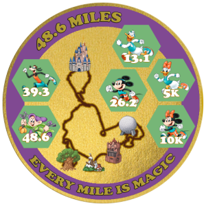
Hey I need some advice on my 2nd coin design - it's been tough trying to one up the previous design and I can't really do it justice. But I do want to make a second one anyway and so I have the following design that I'm trying.
I really liked the new Dopey run pose so I chose to use that for the front and I am thinking of making the color scheme be Green front and Purple back - Dopey colors.
I decided to basically do the same "mini-medals" for the back as the previous design - that way they could actually be interchangeable. And based on a suggestion from
@Mr. lncredible I added a course map on the back.
Help I need:
1) Colors Green and Purple - any other suggestions?
2) Front empty space - what to add there? Do I make Dopey bigger?
3) Back - Ignore the green background for the mini-medals- those would be metal, I just used it as a temporary shape holder.
but do I make any of the parks bigger? Color of course line?
4) Include front Dopey BIB or not? If so, should it be 48.6 instead of 1971, etc?

Note that castle on front won't be colored, it will be metal color like old challenge coin was, but it is centered now.

Yes, technically the 5K is pluto or waldo, etc, but I just chose to include Daisy instead.
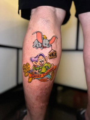
For the front I thought about adding a ribbon across the middle, like the tattoo someone had made of this character

I have a lot of EMPTY space on the front - I really need ideas how to fill that. Also, I may try to do both a silver and gold version of the coin - to see which is better.
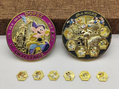
Oh and if you don't recall what last years version looked like, here it is:

Challenge Coin Display Stand
Challenge Coin Display Stand

