TheBigE
Change is inevitable, Growth is optional
- Joined
- Jan 20, 2008
I agree, not much to work with there. Maybe for extreme cases like this upload of a raw file to a place like dropbox would be helpful.
My contribution.. Have at it.
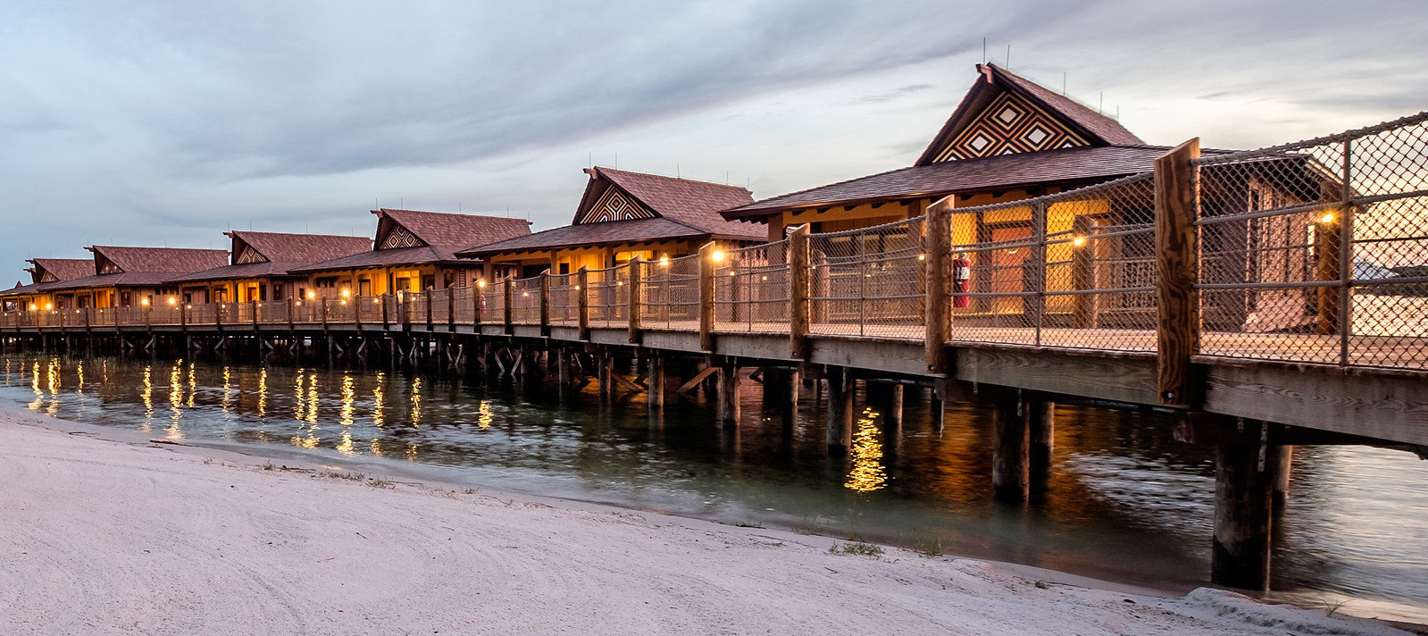
I think you made the right choice on the crop. Fills the frame and provide some leading lines outside the frame. I would like to see some more "orange" in the photo, I get the feeling this is at night and a touch of orange gives that "evening" glow feeling. Not sure how much it could support, but a touch more Orange Saturation....otherwise well done.


 i-tXBQ3Fb-X2
 By Plane, by Water, Misty Fjords
 untitled-228-Edit.jpg
 untitled-228.jpg