MarkBarbieri
Semi-retired
- Joined
- Aug 20, 2006
- Messages
- 6,173
One of the most basic composition guidelines in photography is the rule of thirds. Most people have a natural tendency to place their subject right in the middle of the picture. That often makes for uninteresting pictures.

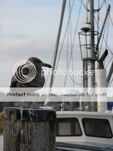
The rule of thirds says that you should imagine that your picture is divided into three parts going up and down and three parts going across. The red lines in the picture above illustrate the dividing lines. Your composition will be more powerful if you place major points of interest along those lines. You get bonus points when a major point of interest is at one of the four places that the lines meet.
One common point of interest is the horizon line in your picture. When I shoot without thinking (which happens all too often), I place the horizon right smack in the middle of the picture. Don't do that. Put it either one third of the way from the top or the bottom. If you want to emphasize the sky, put the horizon lower. If you want to emphasize the foreground, put it higher. If you leave it in the middle, you'll confuse your viewer, who won't be able to tell whether this is a picture of the sky or the foreground.
Another common point of interest are people's eyes. When you see a face, you naturally look into their eyes. The problem many photographers have is that they put the eyes right in the middle of the picture. Again, you'll be better off if you move them up to the top imaginary dividing line. That also avoids having a bunch of wasted space above the persons head.
If you are taking a picture of something moving across the picture, you usually want to place them so that they are on a dividing line moving into the bigger part of the picture. For example, if someone is walking to your right, put them on the left dividing line. This allows them to walk into the picture rather than out of it.
So for this lesson, practice the rule of thirds. Take some pictures with the horizon line on the bottom third, the middle, and the top third. Look at your shots and see how they say different things to the viewer.
Also, take some portrait shots (with the camera on it's side) of a person. First, ignore the rule and shoot them however you'd naturally do it. If you are like me, their eyes will end up right in the middle of the picture. Then reshoot them with their eyes on the top dividing line.
This post is intended to be a starting point. If you would like to add more information on the rule of thirds, please add it. If you want to show the shots you took, others will surely benefit from seeing them.


 and put the horizon way way down on the bottom, no more than 1/3 of the way up but in his early yrs it was way way up( probably upper third) so it made for such a difference in his work, hence showing the importance imo of composition and how what we do can really change the look ...i'll see if i can find 2 egs and post them
")


