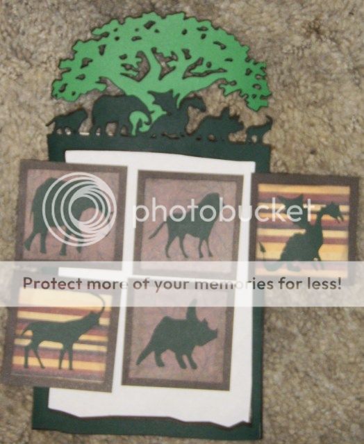
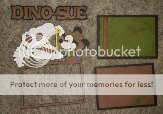
ACTIVE AK Swap -- check in June 11
- Thread starter 123SA
- Start date

")

 it Lisa!
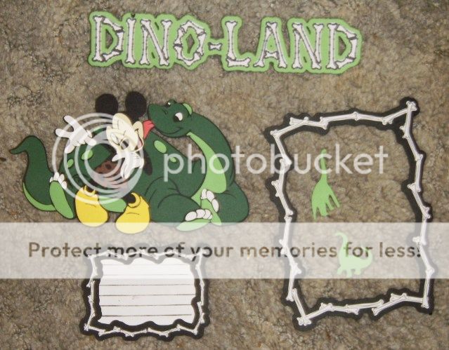
")
 makes no sense to me why not
 :rolleyes:")


Share this page
-
Minnie Mouse & Daisy Duck Bring Style to F1 ACADEMY
-
Behind the Creation Process of New Flower & Garden Features
-
Looking for the Best Disney Fireworks Spot? 5 Things to Consider
-
Disney Should Seize the Moment on Sesame Street
-
Don't Wake the Magic: The Disney Stroller Tip Parents Love
-
A [Piston] Peek at Magic Kingdom's Cars Land Construction
-
New Limited-Time Menu at Summer House in Disney Springs
Disney Vacation Planning. Free. Done for You.

Our Authorized Disney Vacation Planners are here to provide personalized, expert advice, answer every question, and uncover the best discounts.
Let Dreams Unlimited Travel take care of all the details, so you can sit back, relax, and enjoy a stress-free vacation.
Start Your Disney Vacation