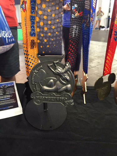
Marathon Weekend 2017!

Here's the 5k

14344348_1075601132508946_4156621479427969783_n.jpg


Edited with a pic with better lighting
 
Last edited:


Eh I'm not big on the 5k one for some reason. It's okay but not my fav.


As usual, the medals look better "in person."

I think the 5K medal and the marathon medal are fantastic! I still don't understand the 10K medal - maybe it's supposed to be scallops like there are on the lace of her "bloomers"?
 
Last edited:
I like them. The Half medal is growing on me; I think it was just unrealistic expectations after the awesome 20th Marathon medal. I am really excited that the Goofy is apparently hiding a giant peanut butter cup.
 
As usual, the medals look better "in person."

I think the 5K medal and the marathon medal are fantastic! I still don't understand the 10K medal - maybe it's supposed to be scallops like there are on the lace of her "bloomers"?

The 10k edging looks like a top-down view of a Minnie running skirt to me. The scalloping looks like the pleating of a skirt with the polka dots from her trademark look visible on them. Just my guess. Otherwise, my personal takes are:

5k: Absolutely love it! They knocked it out of the park on this one!
10k: Looks good. I'd call it average and comparable to last year's.
1/2: Too much "XX" and not enough Donald. OK, but that's about it.
Full: Absolutely love it! Great retro look in a world of super-shiny gold.
Goofy: Don't like it. Nothing in particular, just doesn't work for me.
Dopey: Looks good. Pretty much a stock standard Dopey. Nothing remarkable.
Castaway: Would love to get that one! Not happening, though.
 
I am really excited that the Goofy is apparently hiding a giant peanut butter cup.


if that were true, this would be my favorite medal ever. How boss would it be to be chowing down on your medal-sized peanut butter cup, while all the marathon-only runners stare forlornly at their runner boxes.
 
Thank you for the close-up photos of the medals. Upon seeing them closer, my thoughts:

5K - Love it!
10K - Cool outer design, but really just seems like a smaller version of the previous years.
Half - Cool, but very "meh" to me
Full - Cool design .....if it was 1996. Seriously, it's like they didn't have any ideas and just decided to re-use an old idea. Now if the medal had been more 3D (instead of simply flat) I'd like more.
Goofy - Like this one very much
Dopey - Pretty much standard design. However I hate how they removed all the individual distances. Maybe they are on the back?
Castaway Cay - I like it.
 
My guess is they are going retro this year for something BIG next year for the 25th.

That's just what I was thinking!

I believe that next year's marathon medal will be a life-size, fully-articulated Mickey Mouse that you drape from your neck, complete with motion sensors that trigger 3 different phrases: "Way to go!", "You did it, pal", and "make that chiropractor appointment now".

Actually, I think the "medal" should be a Pal Mickey. Anyone else remember those?
http://allears.net/tp/pal.htm
 
Well, I'm just not thrilled with that half medal. It's okay, but like some others, I feel like it's all about the XX and not so much about Donald. But, whatever, I'll still happily accept it. :)

Love the marathon and Goofy medals though pretty much unreservedly. Since I only started doing runDisney in 2013, I'm okay with a retread from years' past that I don't have.
 

GET A DISNEY VACATION QUOTE

Dreams Unlimited Travel is committed to providing you with the very best vacation planning experience possible. Our Vacation Planners are experts and will share their honest advice to help you have a magical vacation.

Let us help you with your next Disney Vacation!


facebook twitter
Top